Does a Neutral Undertone Really Exist? My Thoughts as a Colour Analyst
- Daria

- Jun 3
- 5 min read
A few months ago, I spent several hours creating a social media post comparing cool and warm shades of green in the same garment. Looking back, I'm not entirely sure why I decided to make life so difficult for myself. Finding identical clothing in every shade proved surprisingly challenging, as fashion brands tend to produce the same colours season after season.

Eventually, I found all the shades I needed for light, deep, and medium-depth colour types. The post performed exceptionally well, attracting a large number of saves and likes, and it remains one of my most popular pieces of content.
Among the many positive comments, however, one stood out:
"Where is the neutral undertone?"
My first instinct was to reply and explain that, in my own colour analysis approach, I do not recognise neutral undertones as a separate category. In my experience, people always lean either warm or cool, even if that tendency is subtle.
Then I thought:
Why not write a blog post about it instead?
Before we continue, I want to make one thing clear. This article is not intended to challenge anyone else's colour theory, observations, or personal preferences. It is simply based on what I have consistently observed while analysing hundreds of colour palettes.
If the concept of a neutral undertone works for you, that's perfectly fine. However, I personally find it unnecessary, and here's why.
Discover Your Undertone And Colours That Make You Glow:
Why I Don't Use Neutral Undertones in Colour Analysis
I fully acknowledge that some complexions appear remarkably balanced. At first glance, they can seem neither particularly warm nor particularly cool.
However, in my experience, when you examine these individuals carefully, their colouring always leans one way or the other.
This is precisely why traditional seasonal colour analysis distinguishes between warm and cool seasons:
Winter and Summer lean cool.
Spring and Autumn lean warm.
The distinction exists because temperature is still present, even when it isn't the most obvious characteristic of the person's colouring.
Which Colour Seasons Often Appear Neutral?
From a traditional seasonal perspective, the individuals most frequently described as neutral tend to belong to categories such as:
Bright Winter
Deep Winter
Bright Spring
Within the Zazu Feu system, I often observe this perception among certain representatives of the Marigold and Hellebore groups. These are people whose colouring can successfully wear a broader range of shades than average, which naturally creates the impression that they sit somewhere in the middle.

Periwinkle -
Light & Cool
Colour Flower
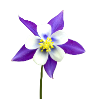
Columbine -
Mid-tone & Cool
Colour Flower

Hellebore -
Deep & Cool
Colour Flower

Buttercup -
Light & Warm
Colour Flower

Marigold -
Mid-tone & Warm Colour Flower

Rudbeckia -
Deep & Warm
Colour Flower
Dsicover more about Zazu Feu System here:
Why People Believe They Have a Neutral Undertone
In many cases, undertone simply isn't the dominant feature of the complexion.
Instead, people first notice characteristics such as:
Colour saturation
Depth
Contrast level
This is particularly common among Winter and Spring colour types.
For example, highly saturated colouring creates a sense of clarity and vibrancy. Because of this, both warm and cool colours may appear reasonably harmonious at first glance.
However, even highly saturated complexions still lean either warm or cool beneath the surface.
The same principle applies to depth.
When someone's colouring is naturally deep, as is often the case with Hellebore types, many deep shades may appear acceptable regardless of temperature. Yet this does not mean undertone has disappeared. It simply means that depth is exerting a stronger influence on the overall appearance.
When Undertone Isn't the Most Important Feature
Some individuals display their undertone very clearly.
Take Beyoncé, for example.

Her colouring is highly saturated, but her warmth is equally noticeable. Neither characteristic overshadows the other.
In other cases, undertone becomes a secondary or even tertiary characteristic.
Selena Gomez is a good example.

In my assessment, Selena has a cool undertone. However, before you notice her coolness, you are likely to notice:
Her colour saturation.
Her depth.
Her contrast.
Her cool undertone.
This is why the most important features of her palette are depth and saturation rather than temperature.
Within the Zazu Feu system, this is one of the reasons she belongs to the Hellebore group. Hellebores can successfully wear ochre yellows, which are considered quite warm in traditional colour analysis. However, strong oranges often become too warm and begin to overpower the complexion. Even when they are of the right depth, something feels slightly off anyway.

Here’s a chart showing the relative visual influence of these two celebrities:

Your personalised Zazu Feu colour analysis is ready for you here. From just £45 and available worldwide – discover your perfect palette today!
Why Fabric Draping Videos Can Be Misleading
You may have seen social media videos where the analyst places extremely cool fabric beside the face, followed by an extremely warm fabric, and then a shade somewhere in between.
Predictably, the middle option often appears to be the most flattering.
But this doesn't necessarily prove the existence of a neutral undertone.
The reality is that extremely cool and extremely warm colourings are relatively uncommon. Most people sit somewhere between these extremes.
Many of the individuals I analyse are:
Not extremely light or extremely deep.
Not strongly warm or strongly cool.
Not highly soft or highly saturated.
This makes self-typing particularly difficult because people often identify with several categories simultaneously while feeling completely certain about none of them.
Why I Created the Zazu Feu Colour Analysis System
One of the reasons I developed the Zazu Feu colour analysis system is that the traditional four-season model felt too restrictive.
At the same time, systems with twelve, sixteen, or even more categories often felt unnecessarily complicated.
The challenge is that every individual possesses a unique combination of:
Undertone
Saturation
Depth
Contrast

To create a separate category for every possible variation would require hundreds of colour types.
Instead, I took inspiration from nature.
Flowers can have countless variations while still belonging to the same family.
The same principle applies to Zazu Feu.
If you are a Rudbeckia, for example, that does not mean you are identical to every other Rudbeckia.
There are countless variations within the group.
You may be slightly warmer or cooler. Slightly deeper or lighter. More saturated or more muted.
Your undertone may even appear close to neutral.
However, it will still lean sufficiently warm to harmonise with the colours contained within the Rudbeckia palette.
And that, ultimately, is why I do not find the concept of a truly neutral undertone necessary. What appears neutral is often simply a complexion where other characteristics — such as saturation, depth, or contrast — speak louder than temperature.
Your personalised Zazu Feu colour analysis is ready for you here. From just £45 and available worldwide – discover your perfect palette today!