
Real Personal Colour Analysis Example: Alexandra

Updated: Jun 30
Below, you’ll find an example of our Blossom service. If you’d like to discover your own colour type, don’t forget to submit your photos on our submission page!
Hello! Today at Zazu Feu, we’re excited to share one of our color analysis cases that’s sure to brighten your day — especially during this cold, rainy winter. Meet Alexandra, a person with an incredible smile and an equally amazing, passionate character.

Alexandra intuitively knows that she looks great in warm colours and it’s no wonder, as she’s a warm and, most importantly, deep color season. Her deep colouring tends to dominate, while her warmth, though secondary, becomes especially noticeable against very cool-toned colours. As a deep and warm colour type, Alexandra is truly nothing else but a radiant Rudbeckia!
Discover more about Rudbeckia here.
But what is Rudbeckia, and why isn't it a traditional season?
What Is Rudbeckia? Understanding the Deep Warm Colour Type

Rudbeckia is one of the six Zazu Feu Colour Flowers: the deep and warm type. It's named after the rich, golden-petalled Rudbeckia flower (also known as Black-Eyed Susan), whose warm, saturated colouring mirrors the type perfectly.
In the traditional seasonal colour analysis system, Rudbeckia would loosely overlap with Deep Autumn or Dark Autumn but the comparison only goes so far. Traditional seasonal analysis groups people primarily by warm versus cool and light versus dark, which often leaves deep warm types caught between an Autumn palette that feels too muted and a Winter palette that doesn't account for their warmth at all.
Rudbeckia solves this by treating depth and warmth as equally important, rather than forcing a choice between them. The result is a palette built specifically around rich, complex, warm colours that have enough density and saturation to match a deep complexion, without losing the warmth that defines the type.
Read also:
The Core Rudbeckia Palette
Rudbeckia's most flattering shades share a few defining qualities: warmth, depth, and a certain richness or complexity rather than flatness. The palette includes:
Deep tomato red and brick red
Burnt orange and rust
Warm chocolate and espresso brown
Mustard and deep golden yellow
Rich olive and forest green
Dark golden amber
Warm plum and brown-based burgundy
Warm burgundy

What unites these shades is that they read like an oil painting rather than a flat block of colour because they are layered, warm, and full of nuance. This is exactly why overly plain, flat, or stark colours tend not to suit Rudbeckia, even within an otherwise flattering hue.
What Kind of Rudbeckia Is Alexandra?
Even if you belong to the same Colour Flower, it doesn't mean that your complexion will be identical. Not at all. It's actually the opposite. Every flower in Zazu Feu's system has hundreds of varieties that help describe what kind of unique complexion you have.
In Alexandra's case, apart from depth and warmth, she has higher-than-medium saturation in her colouring that not every Rudbeckia would have, and also, high contrast that can help create her most striking looks. This means her best Rudbeckia shades are bright enough to shine, and she can easily carry quite a significant amount of contrast in her outfits.
Let's take a look at how the Rudbeckia palette breaks down across light, mid-tone, and dark shades and which ones suit Alexandra best.
Dark Shades
In the chart featuring the darker shades of the Rudbeckia palette, some colours appear a bit too deep for Alexandra, casting subtle shadows on her face. Still, these shades work for her because she doesn't look washed out or overwhelmed. They're perfect for Alexandra's more theatrical or dramatic looks, or can be used sparingly in everyday outfits, such as in accessories.

Light Shades
What reads as mid-tone on lighter colour types will always appear lighter on deeper ones and Alexandra is no exception. These warm shades are bright enough on her to be perfect for spring and summer outfits, or for creating delicate, feminine, and ingenue-inspired looks.

Mid-Tone Shades
Alexandra looks absolutely stunning in the mid-tone Rudbeckia shades. They are the colours that are neither too muted nor too bright, with just the right amount of complexity and depth. These shades are versatile enough to form the foundation of her wardrobe, allowing her to create a wide variety of stylish looks.

As Alexandra's colouring is high in saturation and contrast, her personal Rudbeckia palette looks like this:

Alexandra's Style and How It Works With Her Colours
In her life, Alexandra dedicates her time to working at a busy PR agency and travelling. Her wardrobe reflects this lifestyle, as she values versatility and the comfort of casual looks after long weeks at the office.
We've recreated one of Alexandra's signature looks using the beautiful shades of the Rudbeckia palette.
Beyond her casual looks, Alexandra loves to explore classic, dramatic, and romantic styles. We've helped her create several outfits using her recommended Rudbeckia shades to highlight her unique beauty and preferences.

Rudbeckia Looks for Alexandra

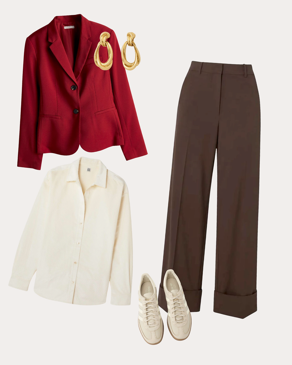
Classic + Casual — Perfect for the office, this look pairs a warm red blazer with neutral brown trousers and an ivory shirt. The combination feels classy while remaining comfortable and versatile.
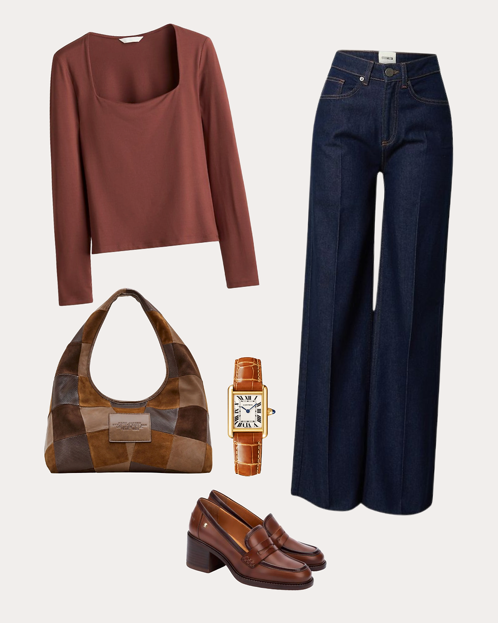
Business Casual — A beautiful play of brown shades, from caramel and toffee to rich chocolate, is perfect for the office, business meetings, or any outfit that makes you feel confident and powerful without relying on bold contrasts or strict lines
Feminine Preppy — A look for those special days off. Whether you're heading for a walk in the park or a trip to the cinema, Rudbeckia's yellow can make any outfit feel joyful and a little more special.

Read later:
It's important to remember that no matter which colour type you belong to, you can wear any style you love. Some styles naturally align more easily with certain colour ranges — for example, vintage styles are often easier to build with warm colour types, while ethereal styles tend to shine on lighter ones. However, with a thoughtful and intentional approach, it's always possible to adapt any style by highlighting your natural strengths.
Which Celebrities Are Rudbeckia Colour Types?
If you're trying to picture the Rudbeckia type beyond Alexandra's photos, a few well-known faces share similar deep, warm colouring. For example, Victoria Beckham's rich, glamorous colouring and effortless command of chocolate brown and warm gold place her firmly in Rudbeckia territory.

To the same list, we can add Jenna Ortega, whose colouring is even deeper, almost matching Hellebore (a deep and cool type). However, black hair and cool colours don't complement her appearance in the same way that warmer shades do.

Read also:
Seeing how this colouring translates across different faces, styles, and eras can help make the abstract idea of a colour type feel much more concrete.
Try our free colour analysis test to discover what Colour Flower you are:
Why Contrast Is Important in Color Analysis
As you now know, Alexandra has quite high contrast in her appearance. What does that mean? It means her natural colouring is made up of opposing values — lighter tones combined with darker ones. Alexandra's eyes are brown and appear especially dark in contrast with her fair skin. Because of this, she can easily dye her hair in much darker shades while still looking natural.
People with high contrast tend to look their best in outfits that reflect a similar level of contrast. For Alexandra, this means she can confidently mix shades from her light palette with deeper, darker tones when she wants to add more drama to her look. This drama never feels artificial on her, as strong contrast is already present in her natural colouring.
For the same reason, brighter lipsticks are also recommended for this type. In the case of Rudbeckia, this includes brown-based reds and warm plum shades.
When we talk about contrast, it's important to note that we don't mean a stark black-and-white contrast. That kind of combination is too harsh for Rudbeckia, whose appearance can be described more like an oil painting: rich, layered, and full of nuanced shades. This complexity is exactly why overly plain or flat colours should be avoided.
You'll find more details on which colours to avoid in our Rudbeckia colour book.
What Is Color Saturation in Personal Colour Analysis?
Contrast is often mistaken for colour saturation, but the two are not the same. Saturation refers to the intensity and clarity in a person's appearance, rather than a combination of two opposing colours. Alexandra's saturation level is relatively high, but not high enough to support very bright colours worn close to her face. Moreover, these shades are usually quite basic and lack the complexity that is recommended for Rudbeckia, which is another reason they are not advised.
Can Dark Colour Seasons Wear Light Colours?
Absolutely. Every colour type — whether light or dark — has both light and dark shades within their palette. Naturally, the light colours suited to light colour types will differ from the light shades that work for dark types. Dark colour types cannot go too watercolour-light, as such shades tend to disappear next to the depth and complexity of their natural colouring.
It's also a misconception that dark colour types find it easier to dress in dark colours. There are always lighter shades within their palette that can be used to create fresh, summery looks without overwhelming or dulling their natural contrast.
Can Warm Colour Types Wear Cool Colours?
Not cool shades, but rather neutral-to-cool ones — that's very possible. What looks neutral, or even slightly warm, on a cool colour season will almost always appear cool on a warm one. That's why truly neutral colours have the ability to suit everyone: taupe, soft grey, navy, charcoal, stone.
Why Zazu Feu's Approach to Colour Analysis Is Different
Alexandra's case is a good example of why we built the Zazu Feu system in the first place. Traditional seasonal colour analysis would have placed her somewhere in the Autumn category and largely stopped there, offering a fairly generic palette based on broad assumptions about what "Autumn" should look like.
But Alexandra isn't generic. Her specific level of contrast and color saturation, and the precise depth of her warmth all matter enormously when it comes to which exact shades make her look radiant versus merely fine. A standard Autumn palette would likely have included plenty of colours too muted or too flat for her natural vibrancy, and missed others entirely that suit her perfectly.
This is what the Zazu Feu system is built to capture: not just whether you're warm or cool, but the full picture of your depth, brightness, and contrast working together. That precision is what allows us to recommend specific, individual shades — like the ones in Alexandra's case study — rather than a broad seasonal category and a hope that it fits.
If you are a Rudbeckia and want to learn more about your personal colours, how to wear them, and how to handle shades that aren't naturally yours, check out Zazu Feu's Rudbeckia Colour Book.
Not sure if you're a Rudbeckia? We also offer personalised color analysis services to help you discover your true shine.
We would like to sincerely thank Alexandra for kindly allowing us to use her photos in this post.
How Alexandra's Analysis Was Done: Our Personalised Colour Services
Alexandra's results, including her visual palette and curated outfit looks, came from our Blossom package — our most popular level of personalised colour analysis. This is what made it possible to show her exact key shades and how they translate into real outfits, rather than simply confirming she's a Rudbeckia and leaving it there.
If you'd like a similar experience, here's how our three packages compare, so you can choose the level of detail that's right for you.
Bloom — Perfect to Start
Bloom is the simplest way to discover your colour type. You'll receive:
Your colour type analysis
Your type's full colour book (25 pages of colour tips and expert advice)
This is the right choice if you're new to colour analysis and want a clear, reliable answer to "what's my colour type?" along with practical guidance on how to start using it.
Blossom — Our Most Popular
Blossom builds on Bloom with a more visual, practical layer. You'll receive everything in Bloom, plus:
A visual palette of your 15 key shades
This is ideal if you already have a general sense of your colouring, or simply want to see your palette laid out clearly rather than working from written guidance alone. It's our most popular package because it strikes a strong balance between depth and simplicity — and it's exactly what gave Alexandra the visual palette and shade guidance you can see in her case study above.
Flourish — The Complete Picture
Flourish is our most detailed service. You'll receive everything in Blossom, plus:
50 individual colour swatches, mapped specifically to your contrast, saturation, and depth
Designed for effortless online shopping, so you can match new pieces to your palette before you buy
This is the right choice if you want to go even further than Alexandra's results, with every shade, light to dark, individually swatched against your specific colouring rather than grouped into a key palette.
More Real Colour Analysis Case Studies
Alexandra's Rudbeckia results are just one example of how personalised colour analysis works in practice. If you'd like to see how other colour types come to life on real people, explore our other case studies:
Frequently Asked Questions
What is the Rudbeckia colour type?
Rudbeckia is one of the six Zazu Feu Colour Flowers — the deep and warm type. It's defined by rich, warm undertones combined with a deeper overall colouring, and it loosely corresponds to Deep or Dark Autumn in traditional seasonal analysis, though with far more precision around individual depth, brightness, and contrast.
How do I know my personal colour type?
You can start by noticing which shades make your skin, eyes, and hair pop versus which ones wash you out. For a precise answer, try our professional colour analysis or our free colour analysis quiz, which takes just a few minutes.
What role do saturation and contrast play in personal color analysis?
Your natural color saturation (light to dark) and contrast (the difference between your features) determine which shades enhance your look. Matching these helps you feel more vibrant and polished, rather than simply choosing colours that are broadly warm or cool.
Can I mix my "non-ideal" colours into my wardrobe?
Yes. You can wear shades outside your palette if you balance them with colours that suit you. Accessories, layering, or pairing with your key shades can make almost any colour work.
Does hair colour or eye colour change my type?
Hair dye can temporarily affect which shades look best, but your natural colouring — skin tone and eye colour together — is the main factor in determining your Colour Flower. Discover more at: Hair Colour Analysis: What Hair Colour To Choose If You Don't Know
What if I feel like I'm "between" two colour types?
Some people have traits of more than one type. In those cases, focus on the colours that bring out your strongest natural features, and experiment to find your personal sweet spot. A personalised analysis can also help clarify exactly where you sit.
How can I use personal color analysis to shop smarter?
Once you know your palette, you can select clothing, accessories, and makeup more confidently. This reduces shopping mistakes and ensures your outfits are flattering and harmonious, rather than relying on trial and error. Discover more at: How Knowing Your Colours Helps You Save Money on Your Wardrobe
Is Rudbeckia the same as Deep Autumn?
Rudbeckia overlaps significantly with Deep Autumn but isn't identical to it. While Deep Autumn focuses primarily on warmth and depth, Rudbeckia also accounts for individual brightness and contrast levels which is why two people who might both be labelled Deep Autumn in traditional analysis could have quite different ideal palettes within the Rudbeckia system.
What's the difference between Bloom, Blossom, and Flourish?
Bloom identifies your colour type and gives you a full colour book of guidance. Blossom adds a visual palette of your 15 key shades — the level of detail behind case studies like Alexandra's. Flourish goes furthest still, with 50 individual colour swatches mapped to your specific contrast and brightness.

