Flourish Case Study: Abbie’s Personal Colour Analysis — Periwinkle
- Daria

- Mar 3
- 3 min read
If you're interested in your basic colour analysis + general recommendations for your colour type, please visit our Bloom Page.
Below, you’ll find insights from our Flourish Service, including your personal colour analysis, style study with 5 inspirational looks based on your style and colours, and a palette of 50 signature colours.
Today, we’re diving into the pretty Periwinkle's case: Abbie. Let’s explore how her colours come together to create a harmonious, signature style.

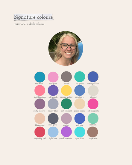
Why 'Periwinkle'?
When we look at Abbie, we immediately notice her gentle, light colouring. If you had to describe her in one word, it would likely be “light.” Her overall appearance is delicate, soft, and subtle.
Truly dark colours tend to overpower her, drawing all the attention to themselves rather than allowing her natural features to shine. Her undertone is close to neutral, with a slight lean toward the cooler, fresher side. Her brightness sits just above medium, while her overall contrast level is low.

Let's have a look at Periwinkle's shades next to Abbie:

Abbie is so light in her overall colouring that even the darker shades of Periwinkle appear deep on her — while on other colour types, those same shades might register as mid-tones or even light colours.
One of the great advantages of her colouring is that she can wear pastels effortlessly without them looking washed out or like sleepwear. On her, they feel natural, elevated, and harmonious. It’s a truly tender, almost fairy-like colour type — delicate yet luminous.
Abbie’s contrast is quite low, but her brightness (chroma) is high. That’s why we’ve chosen colours for her that are light, bright, and almost neutral — slightly on the cool side, but not overly cool-toned.
Because her contrast is low, it’s not recommended to combine very light shades with very dark shades in the same look. Instead, we can mix light tones with mid-tones, and mid-tones with darker shades, to create a softer and more harmonious look.


How To Use Your Type's Colours With Your Style
Abbie wears a casual style with strong romantic influences, such as sweetheart necklines, flowy fabrics, and floral prints:

We curated the following looks around Abbie’s personal style and her Periwinkle palette, incorporating soft, casual silhouettes with feminine and romantic details in both clothing and accessories:


Abbie Can Wear All Periwinkle's Colours
Being one colour type — in this case, Abbie being a Periwinkle — means she can successfully wear all Periwinkle colours, and it’s a really large palette!
However, they won’t look the same as her signature palette. If we imagine it as a funnel, one colour type’s palette can be divided into different levels. At the centre are your signature shades — the most harmonious ones. As you move outward, the colours still suit you, just with slightly less impact.
Nevertheless, it’s still your full palette, so you can use any of those colours depending on your mood or the occasion.
What Else Flourish Package Includes
As part of our Flourish package, Abbie also received our comprehensive Periwinkle colour type guide.

It includes a list of celebrities who belong to the type, the main colours and their characteristics, along with images of celebrities wearing those shades.
The guide also features several pages dedicated to colours that are less harmonious and how to work around them. There are inspirational mood boards for exploring something new — clothing styles that align most harmoniously with Periwinkle’s energy and colouring.
In addition, we cover the best hair colours, jewellery choices, and make-up recommendations: contouring, foundation, eye make-up, lip colours, and the ideal balance between matte and gloss.
If you can see yourself in Abbie's place and would love to receive everything listed above, please submit your photos here. We are looking forward to finding your signature colours.


