
Kate Middleton's Colour Analysis - What Colours Make Her Glow
Today, the heroine of our blog post is a truly royal lady and we’re not just talking about her title, but also about the colours that perfectly complement her unique deep complexion: Kate Middleton.

At Zazu Feu, we use our own colour analysis system based on six flowers (we've explained why here), and in this system Kate Middleton is a Hellebore.

Periwinkle -
Light & Cool
Colour Flower
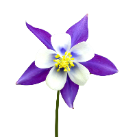
Columbine -
Mid-tone & Cool
Colour Flower

Hellebore -
Deep & Cool
Colour Flower

Buttercup -
Light & Warm
Colour Flower

Marigold -
Mid-tone & Warm Colour Flower

Rudbeckia -
Deep & Warm
Colour Flower
But what does that actually mean?
It means that the first thing you notice in her complexion is how deep her natural colouring is. Her undertone is slightly on the cool side, which allows her to wear deep, cool colours with ease and glow in them effortlessly. Whether it’s the emerald green or cool-tone burgundy, Kate always looks Queen-like (check out our slides further below).
By the way, At Zazu Feu, we make discovering your best colours simple and accessible. Try our free colour analysis quiz. It only takes a few minutes.
What Colours Kate Middleton Looks Best Wearing?
Kate Middleton looks beautiful in deep, slightly cool-toned colours: think sapphire, emerald, and ruby shades. As Hellebore is the “darkest” Colour Flower in our system, black looks chic and elegant on Kate.
Kate can easily wear black close to her face, including hats and other head accessories, without it ever overwhelming her or making her features look harsh.
Her natural colouring is also relatively soft, which is why she doesn’t need highly saturated colours. In her case, complex, deep, softened colours — such as cool burgundy — enhance her beauty best by smoothing the appearance of her skin and bringing out the colour of her eyes.
Check it out for yourself:
Interested in finding your best colours to wear? Try our colour analysis quiz.

