David Beckham's Colour Analysis
- Daria

- Jun 15
- 4 min read
David Beckham is one of those men who always seems to look right. Whether he's in a suit at a premiere, in casualwear on the school run, or in a football kit, there's a consistency to how well his clothes seem to work on him. A lot of that comes down to something most people never consciously notice: his colours.
Beckham's Natural Colouring
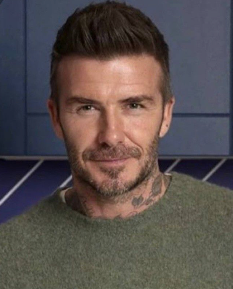
Beckham has warm, golden-toned skin that deepens beautifully in the sun. His eyes are a warm hazel-brown, and his hair, natural or dyed, has always stayed in the warm brown to darker brunette range. Even the grey that's crept in over the years sits warmly against his complexion.
His overall colouring is warm in undertone, medium-to-deep in depth, and relatively low in contrast which means his skin, hair, and eyes all exist in a similar warm tonal family.

His Colour Flower: Marigold
In the Zazu Feu Colour Flowers system, David Beckham is a Marigold.

Periwinkle -
Light & Cool
Colour Flower
Columbine -
Mid-tone & Cool
Colour Flower

Hellebore -
Deep & Cool
Colour Flower

Buttercup -
Light & Warm
Colour Flower

Marigold -
Mid-tone & Warm Colour Flower

Rudbeckia -
Deep & Warm
Colour Flower
Dsicover more about Zazu Feu System here:
Marigold types have warm richness in their colouring. They have golden or olive undertones and look their absolute best in the earthy, sun-warmed end of the colour spectrum. Think soft terracotta, warm camel, olive green, tobacco brown, burnt orange without too much depth, tomato red and caramel brown. Creamy off-whites rather than stark bright white. Gold jewellery or neutral dark silver rather than cool-toned metals.
These are the colours that make a Marigold type look lit from within. They are warm, vibrant, and healthy.
Find whether you're Marigold or another Colour Flower with our colour analysis quiz:
What Beckham Gets Right When It Comes To Colours To Wear
Look back through years of Beckham's wardrobe and you'll spot the pattern:
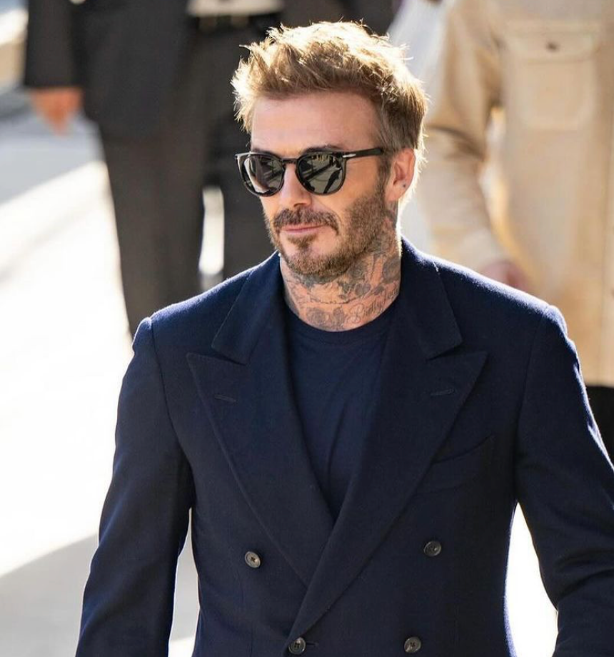
Camel and tan. He reaches for camel coats and tan leather jackets constantly. These are quintessential Marigold colours because they are warm, rich, and perfectly in sync with his undertone.

Olive and khaki. His casualwear frequently features olive greens and khaki tones. Again, warm earthy shades that work with his complexion rather than against it.
Neutral navy. In formal contexts, he often gravitates to warm-toned navy (with a hint of teal rather than icy blue).
Warm neutrals over cold ones. He tends to avoid the icy greys and bright stark whites that would fight with his golden undertone. When he does wear white, it's typically in warm, natural-fabric contexts where the material itself has a warmer cast, like here.
What Colours Wouldn't Work For David Beckham's Complexion
Cool tones are where Marigold types can run into trouble. Icy blues, silver, cool bubblegum pinks, and stark white tend to fight against warm undertones, pulling the skin sallow or creating an unbalanced, washed-out look. Beckham largely steers clear of these instinctively, which is part of why his style looks so natural.
Find whether you're Marigold or another Colour Flower with our colour analysis quiz:
What Marigold Men Can Take From This
If you share Beckham's warm, earthy colouring, your wardrobe formula is actually quite simple:
- Build around warm neutrals: camel, tan, chocolate, olive, warm stone
- Accent with rich warm tones that don't read too dark: soft terracotta, burnt orange, warm rust and milk chocolate brown
- Choose warm navy and warm forest green over icy or cool versions of the same colours
- Reach for yellow gold or dark silver (vintage-feel) over shiny sterling silver or white gold
- Choose off-white and cream over bright or cool white
If you want to look the same natural and harmonious like David Beckham it's important to discover what colours suit your natural colouring. And colour analysis is a great tool for that. Colour analysis isn't only for women. The underlying principles (how your skin tone, eye colour, and hair interact with the colours around them) apply to every face, regardless of who it belongs to.
I'm happy to say though that things are changing. More men are seeking out colour analysis now because they feel more comfortable acknowledging that they care about how they look and want to feel good in what they wear.
Colour analysis is a practical tool. It works for anyone, regardless of gender, background, sexuality or personal style. Book it today:
Zazu Feu colour analysis comes in three tiers, so you can choose the level that suits your needs and budget.
Bloom Colour Analysis is where your colour journey begins. We establish the foundations of your colour identity whether your natural colouring sits on the warm or cool side, how much contrast you carry, and how much saturation your complexion can hold. Some complexions are naturally soft and muted; others are vivid and bright. Knowing this shapes every colour decision you make.
Blossom Colour Analysis goes deeper. As well as everything in Bloom, this tier is tailored to the way you actually dress. We use real photos of you, so we can show you how your existing style translates into your best colours, so you can see the difference in context, not just in theory. You'll also receive your 15 most signature shades to keep as a personal reference.
Flourish Colour Analysis is our most complete offering. Everything from Blossom, plus a wider range of personalised looks and a full palette of 50 signature shades, so you can shop with complete confidence, every time.
Getting started is simple. All you need to do is prepare a few draping photos: gather some fabric swatches in warm, cool, dark, and light tones, hold them next to your face in natural daylight, and take a clear photo where your eye colour is visible. Then complete our submission form, adding your draping photos alongside six everyday photos of yourself: these help us read your colouring in the context of your clothing, style, and personality.
You can find full details on our colour analysis service page: