Winter Colour Analysis Palette: Your Complete Guide — and Why Your Exact Palette Is More Unique Than You Think
- Daria

- 2 days ago
- 7 min read

If you've been researching colour analysis and landed on Winter, you've probably already found lists of colours: black, white, jewel tones, icy pastels, cool navy. And you've probably also found that the more you read, the more confused you get.
Am I a True Winter or a Deep Winter? A Cool Winter or a Bright Winter? Do I suit icy pastels or deep saturated shades? Is black actually good for me or does it wash me out?
These are the questions that come up constantly and they come up because the seasonal system, as helpful as it is as a starting point, has real limitations when it comes to translating a broad colour season into an actual wardrobe. Let's go through everything properly.
What Is the Winter Colour Analysis Palette?
The Winter palette in seasonal colour analysis is defined by three characteristics: cool undertones, depth, and contrast.
Winter is one of the most versatile colour seasons because it includes a wide range of skin tones and hair colours, but what all Winter types have in common is contrast. Winter features are typically defined, cool-toned, and stand out best when paired with vivid, clear colours.
The palette itself spans a wide range: from the deepest blacks and rich jewel tones to icy, near-white shades at the light end. Winter is the only palette that features both pure white and pure black, which tells you something about how broad the contrast range within Winter actually is.
The colours most commonly associated with the Winter palette include:
True black and pure white
Cool, clear navy
Jewel tones: emerald, sapphire, amethyst, cool ruby
Icy versions of colours: ice pink, ice blue, ice violet, ice yellow
Cool, vivid raspberry and fuchsia
Deep cool burgundy and wine
Charcoal and cool grey
What unites all of these is a cool undertone and a clarity (all colours are very crisp).
Who Is a Winter Type?
Winter types have cool undertones in their skin (a pink, rosy, or blue-neutral quality rather than golden or peachy) and an overall colouring that feels defined rather than soft.
You might be a Winter type if:
Stark white looks better on you than cream. This is one of the most reliable quick tests. Cool undertones handle the crispness of pure white well; cream and warm ivory can make cool skin look slightly sallow.
Black feels like a natural neutral. Many Winter types gravitate to black instinctively because it sits harmoniously with cool colouring and high contrast in a way that can feel effortless.
Jewel tones make your eyes come alive. Emerald, cobalt, vivid ruby, sapphire — if these shades make your skin look clearer and your eyes more vivid, your colouring has the cool clarity that the Winter palette is built around.
Earthy, warm shades feel slightly off. Camel, rust, warm orange, golden yellow — if these tend to make you look tired or washed out, your undertone is likely cool.
The Three Winter Sub-Seasons
This is where seasonal colour analysis gets more precise, and where a lot of people get stuck. The Winter palette is cool, clear, saturated and high contrast because it contains everything from icy turquoise to jewel bright fuchsia, through to stark black and white. That's an enormous range for one season. The sub-seasons narrow it down.
True Winter (also called Cool Winter or Jewel Winter) sits at the centre of the Winter palette. True Winters look the best in the widest range of Winter colours, as they really do sit bang in the middle of this palette — vivid jewel tones, black, white, icy shades, cool navy. Their colouring has an even balance of coolness, depth and contrast without leaning strongly in any particular direction.
Deep Winter sits at the border between Winter and Autumn, sharing Winter's cool undertone but with depth as a more dominant characteristic. The ideal colours for Deep Winter are deep and predominantly cool tones: black, midnight blue, forest or petroleum green, charcoal grey, dark burgundy. Icy pastels tend to look too light against the depth of Deep Winter colouring.
Bright Winter (also called Clear Winter) shares characteristics with Bright Spring — the dominant quality is clarity and brightness rather than depth. Bright Winters have a vivid, almost sparkling quality to their features. Their best colours are vivid and clear — bright fuchsia, electric blue, clear emerald. Deep, very muted shades can feel heavy.
Where the Seasonal System Stops Being Useful
Here is the honest limitation of the Winter palette as a concept: two people can both be "Winter types" and have significantly different best colours.
A pale, high-contrast True Winter with blue eyes and dark hair has a very different best palette to a Deep Winter with medium olive skin, dark eyes and dark hair. Both are Winter with cool undertones.
Read later:
Quiz: What Colour Season Am I
But the specific shades that make each of them glow are not the same and a generic Winter palette card doesn't tell you which end of that spectrum you sit on.
This is why in my work at Zazu Feu, I don't use the seasonal system. Instead I use the Colour Flowers — a more nuanced and contemporary approach that was developed because the seasonal model, created more than forty years ago, simply doesn't give enough precision for most people to actually use their result.

Buttercup -
Light & Warm
Colour Flower

Marigold -
Mid-tone & Warm
Colour Flower

Rudbeckia -
Deep & Warm
Colour Flower

Periwinkle -
Light & Cool
Colour Flower
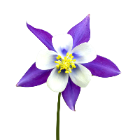
Columbine -
Mid-tone & Cool
Colour Flower

Hellebore -
Deep & Cool
Colour Flower
Find your Colour Flower here. It only takes a few minutes:
The Zazu Feu Colour Flowers for Cool Types
Rather than one broad Winter category, the Zazu Feu system identifies three distinct cool Colour Flowers — each with its own specific palette:
Periwinkle — Light & Cool The lightest of the cool types. Periwinkle types have cool undertones and a delicate, airy quality to their colouring. Their best colours are cool but light and soft — powder blue, cool soft pinks, light lavender, silver. Heavy, very dark shades can feel overwhelming but in our Periwinkle colour guide we've described how to wear them safely.
Discover more about Periwinkle here.
Columbine — Mid-tone & Cool The mid-range cool type — neither dramatically light nor very deep. Columbine types suit cool, clear shades across a medium range of depth: cool navy, clear raspberry, cool teal, medium jewel tones, soft cool greys. This is the type that often falls close to Cool or Deep Winter in the seasonal system, and feels like neither fits quite right.
Discover more about Columbine here.
Hellebore — Deep & Cool The deepest cool type, equivalent to Deep Winter in the seasonal system. Hellebore types have cool undertones and depth as a dominant characteristic — their best colours are rich, deep and cool: black, deep jewel tones, cool burgundy, midnight navy, deep cool teal. Icy pastels work as accents rather than main colours.
Discover more about Hellebore here.
This distinction between three cool types, rather than one broad Winter, is what makes the difference between a colour result that's useful and one that still leaves you confused in the fitting room.
Another good thing about Colour Flowers is that, for example, two Hellebores won't be the same in depth, undertone, and colour saturation, and this is normal. Every person receives general and individual palettes that match their complexion precisely.
We've got a few case studies you can read through to see how we analyse your appearance and colours:
The Colours That Work Across All Cool Types
Regardless of whether you sit in the light, mid-tone or deep end of the cool spectrum, certain colours tend to work for all cool types:
Cool navy — not warm navy with a teal or purple cast, but a true, crisp navy. Works beautifully across all cool types.
Cool teal and peacock — a blue-green with a cool rather than warm base. One of the most universally flattering shades for cool undertones.
Rose and cool pink — the deeper, cooler versions. Cool rose, cool raspberry, and cool berry work across all three cool types, varying only in depth.
Silver — as a metal and as a shade. Cool silver-grey in clothing, silver jewellery. Consistently more harmonious than gold for cool undertones.
True white — crisp, cool white rather than cream or warm ivory. All cool types tend to look cleaner and fresher in true white.

What Colours to Avoid as a Cool Type
The colours that tend to work least well for cool undertones are those with warmth baked into them:
camel,
rust,
golden yellow,
warm orange,
warm olive green,
warm brown.
These colours make this specific complexion look less vivid and more tired.
How to Find Out If You're a Winter and Which Cool Type
The most reliable method is professional colour draping which consists of holding actual fabric swatches next to the face in natural light and observing how the skin responds.
As a starting point at home, the most useful things you can do are:
Try true white and cream side by side near your face in natural light. The one that makes your skin look clearer tells you your undertone direction (warning: this works only if your colour saturation is high, in other case you'll be confused with the results).
Try a vivid jewel tone — cobalt blue or emerald green — near your face, then a warm earthy shade like rust or camel. The one that makes your eyes more vivid and your skin less tired tells you whether warm or cool is working. (again your colour saturation may not be high enough to match cobalt blue, for example, in that case it's better to try softened cobalt blue or any obviously cool blue and compared it to certainly warm colours like soft terracotta).
Try rich deep shades to check whether you can be a Hellebore. If deep grape purple or wine feels a bit too much it's worth considering Columbine or even Periwinkle.
If you'd like to skip the guesswork, you can take our free colour analysis quiz as a first step, or go straight to a professional online colour analysis where I look at your actual colouring and give you a precise Colour Flower result — along with a specific palette for clothing, makeup, hair colour and accessories.
You can get started by filling in the submission form. I work with clients across the UK and worldwide.
Discover our colour analysis services here:
Zazu Feu is a colour analyst based in the UK, offering online colour analysis using the unique Colour Flowers system. If the seasonal system has left you with more questions than answers, the Colour Flowers might be exactly what you're looking for.